ShopDreamUp AI ArtDreamUp
Deviation Actions


Suggested Deviants
![Tohru Honda (Carefree) [V1]](https://images-wixmp-ed30a86b8c4ca887773594c2.wixmp.com/f/db95d15b-8c0c-4bb6-b743-1beb61737925/d79zgds-47bd74e0-2a59-48b2-a1b3-691f4198bc8d.gif?token=eyJ0eXAiOiJKV1QiLCJhbGciOiJIUzI1NiJ9.eyJzdWIiOiJ1cm46YXBwOjdlMGQxODg5ODIyNjQzNzNhNWYwZDQxNWVhMGQyNmUwIiwiaXNzIjoidXJuOmFwcDo3ZTBkMTg4OTgyMjY0MzczYTVmMGQ0MTVlYTBkMjZlMCIsIm9iaiI6W1t7InBhdGgiOiJcL2ZcL2RiOTVkMTViLThjMGMtNGJiNi1iNzQzLTFiZWI2MTczNzkyNVwvZDc5emdkcy00N2JkNzRlMC0yYTU5LTQ4YjItYTFiMy02OTFmNDE5OGJjOGQuZ2lmIn1dXSwiYXVkIjpbInVybjpzZXJ2aWNlOmZpbGUuZG93bmxvYWQiXX0.jSaXdnr0yUN9j-RbQgdcZi58InTi9WhKW2EbBzDrPlg)
![Minori Kushieda (Happy) [V1]](https://images-wixmp-ed30a86b8c4ca887773594c2.wixmp.com/f/db95d15b-8c0c-4bb6-b743-1beb61737925/d6x64eb-df8e39d1-99af-4651-8070-90628cad2f51.gif?token=eyJ0eXAiOiJKV1QiLCJhbGciOiJIUzI1NiJ9.eyJzdWIiOiJ1cm46YXBwOjdlMGQxODg5ODIyNjQzNzNhNWYwZDQxNWVhMGQyNmUwIiwiaXNzIjoidXJuOmFwcDo3ZTBkMTg4OTgyMjY0MzczYTVmMGQ0MTVlYTBkMjZlMCIsIm9iaiI6W1t7InBhdGgiOiJcL2ZcL2RiOTVkMTViLThjMGMtNGJiNi1iNzQzLTFiZWI2MTczNzkyNVwvZDZ4NjRlYi1kZjhlMzlkMS05OWFmLTQ2NTEtODA3MC05MDYyOGNhZDJmNTEuZ2lmIn1dXSwiYXVkIjpbInVybjpzZXJ2aWNlOmZpbGUuZG93bmxvYWQiXX0.s7_IyfQZEXWMb8L9GlTgkG1apnG6EYeZdVpZDzT4dVY)


Suggested Collections
![[MMD animation practice] Talking](https://images-wixmp-ed30a86b8c4ca887773594c2.wixmp.com/f/f3d10812-7dd1-451f-b62c-239362c2e096/d8ine3x-6087193a-a3d9-4a8f-ad1a-52dcbe1caea8.gif/v1/crop/w_184,h_184,x_5,y_0,scl_0.25555555555556/_mmd_animation_practice__talking_by_fukkatsumimori_d8ine3x-92s-2x.png?token=eyJ0eXAiOiJKV1QiLCJhbGciOiJIUzI1NiJ9.eyJzdWIiOiJ1cm46YXBwOjdlMGQxODg5ODIyNjQzNzNhNWYwZDQxNWVhMGQyNmUwIiwiaXNzIjoidXJuOmFwcDo3ZTBkMTg4OTgyMjY0MzczYTVmMGQ0MTVlYTBkMjZlMCIsIm9iaiI6W1t7ImhlaWdodCI6Ijw9NzIwIiwicGF0aCI6IlwvZlwvZjNkMTA4MTItN2RkMS00NTFmLWI2MmMtMjM5MzYyYzJlMDk2XC9kOGluZTN4LTYwODcxOTNhLWEzZDktNGE4Zi1hZDFhLTUyZGNiZTFjYWVhOC5naWYiLCJ3aWR0aCI6Ijw9ODAwIn1dXSwiYXVkIjpbInVybjpzZXJ2aWNlOmltYWdlLm9wZXJhdGlvbnMiXX0.XCrSNbYOdlkj8vjXFuSaRARNWaXmklLitnvV2N8G0UU)
![[MMD animation practice] Talking](https://images-wixmp-ed30a86b8c4ca887773594c2.wixmp.com/f/f3d10812-7dd1-451f-b62c-239362c2e096/d8ine3x-6087193a-a3d9-4a8f-ad1a-52dcbe1caea8.gif/v1/crop/w_92,h_92,x_3,y_0,scl_0.12777777777778/_mmd_animation_practice__talking_by_fukkatsumimori_d8ine3x-92s.png?token=eyJ0eXAiOiJKV1QiLCJhbGciOiJIUzI1NiJ9.eyJzdWIiOiJ1cm46YXBwOjdlMGQxODg5ODIyNjQzNzNhNWYwZDQxNWVhMGQyNmUwIiwiaXNzIjoidXJuOmFwcDo3ZTBkMTg4OTgyMjY0MzczYTVmMGQ0MTVlYTBkMjZlMCIsIm9iaiI6W1t7ImhlaWdodCI6Ijw9NzIwIiwicGF0aCI6IlwvZlwvZjNkMTA4MTItN2RkMS00NTFmLWI2MmMtMjM5MzYyYzJlMDk2XC9kOGluZTN4LTYwODcxOTNhLWEzZDktNGE4Zi1hZDFhLTUyZGNiZTFjYWVhOC5naWYiLCJ3aWR0aCI6Ijw9ODAwIn1dXSwiYXVkIjpbInVybjpzZXJ2aWNlOmltYWdlLm9wZXJhdGlvbnMiXX0.XCrSNbYOdlkj8vjXFuSaRARNWaXmklLitnvV2N8G0UU)


You Might Like…


Comments10
Join the community to add your comment. Already a deviant? Log In
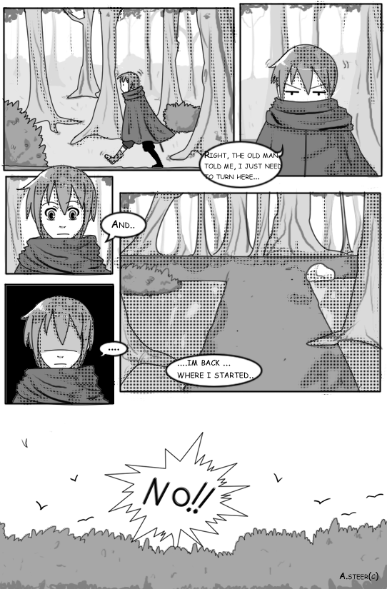
Okay, I'm going to actually post my "crit" here, and on the individual pages. The main body will be here, and stuff that needs the visual aid to say what I want to say will be here. :3
Overall, pretty good! Your people skills have come up A LOT, and I'm really impressed. You're telling a story, and it's not too confusing. ;3 So good job. I just want to make sure you know you DID a good job before I get to the "how to do better" bit. :3
Here goes: I think the best thing to say is you are trying to say too much on one page. This hold true across your pages. There's too much information in too little space. Comic pace is actually REALLY. SLOW.
When you're writing a story, it only takes a sentence or so to establish place, time, atmosphere (It was a dark and stormy night ...), and a few more sentences to establish character, and introduce the plot. Comic creation is a lot like poetry in that you have to choose only the absolutely necessary bits, and say them in the exactly right words. That's one of the reasons it's so awesome.") (and a bit of a puzzle to make. :3 )
(and a bit of a puzzle to make. :3 )
Your panel layout for this page is pretty good. I *personally* like more uniform panels, but that is a me thing. I can tell you're modeling on a different style, and that's fine. Your panels work well, drawing the reader's eyes across the page, to follow the storyline. Points for you!
The information included in the panels doesn't tell as much as I think you want it too.
Panel 1: Someone is walking in a forest during the day. <- that's all the info I get. Is that all I need? Is that all you want to say? I naturally assume this is the protagonist. Is it? (This becomes confusing later on with the last 2 pages. I really don't know WHO this story is about. Is it about both of them?)
Anyway, moving on, the next three panels are basically repeats of each other. Same kind of shot (headshot) same angle same lighting. The only thing that changes is the characters expression - and that doesn't change much. (I think you could work on being a lot more expressive in your expressions. But so do I. D= ) I can tell by the layout that the 3rd and 4th panel belong together (good job), but the 2nd doesn't - but it LOOKS the same. What could you show the character doing that would be different in expression & action from panel 3/4? Zoom in on squinting eyes? Show them full-body stopped in confusion?
Characters in comics should say just as much if not MORE in body language than in actual words.
In panel 5, I'm a bit confused. I have to rely on the WORDS to tell me we're back where we started. (Try to avoid that whenever possible.) Maybe show the character's reaction, or show an arrow they carved in a tree, or something, instead of just a shot of crossroads, and TELLING ME, "back where we started."
I do like panel 6 - I think though that if you showed the birds flying away FROM the shout, it would help relate the two together. Right now, the birds are just randomly flying in the picture (ooh, pretty), instead of REACTING to the shout. If they were all emanating AWAY from that point, I think that would help.
Moving on to the 2nd page!
~Istra~
Overall, pretty good! Your people skills have come up A LOT, and I'm really impressed. You're telling a story, and it's not too confusing. ;3 So good job. I just want to make sure you know you DID a good job before I get to the "how to do better" bit. :3
Here goes: I think the best thing to say is you are trying to say too much on one page. This hold true across your pages. There's too much information in too little space. Comic pace is actually REALLY. SLOW.
When you're writing a story, it only takes a sentence or so to establish place, time, atmosphere (It was a dark and stormy night ...), and a few more sentences to establish character, and introduce the plot. Comic creation is a lot like poetry in that you have to choose only the absolutely necessary bits, and say them in the exactly right words. That's one of the reasons it's so awesome.
Your panel layout for this page is pretty good. I *personally* like more uniform panels, but that is a me thing. I can tell you're modeling on a different style, and that's fine. Your panels work well, drawing the reader's eyes across the page, to follow the storyline. Points for you!
The information included in the panels doesn't tell as much as I think you want it too.
Panel 1: Someone is walking in a forest during the day. <- that's all the info I get. Is that all I need? Is that all you want to say? I naturally assume this is the protagonist. Is it? (This becomes confusing later on with the last 2 pages. I really don't know WHO this story is about. Is it about both of them?)
Anyway, moving on, the next three panels are basically repeats of each other. Same kind of shot (headshot) same angle same lighting. The only thing that changes is the characters expression - and that doesn't change much. (I think you could work on being a lot more expressive in your expressions. But so do I. D= ) I can tell by the layout that the 3rd and 4th panel belong together (good job), but the 2nd doesn't - but it LOOKS the same. What could you show the character doing that would be different in expression & action from panel 3/4? Zoom in on squinting eyes? Show them full-body stopped in confusion?
Characters in comics should say just as much if not MORE in body language than in actual words.
In panel 5, I'm a bit confused. I have to rely on the WORDS to tell me we're back where we started. (Try to avoid that whenever possible.) Maybe show the character's reaction, or show an arrow they carved in a tree, or something, instead of just a shot of crossroads, and TELLING ME, "back where we started."
I do like panel 6 - I think though that if you showed the birds flying away FROM the shout, it would help relate the two together. Right now, the birds are just randomly flying in the picture (ooh, pretty), instead of REACTING to the shout. If they were all emanating AWAY from that point, I think that would help.
Moving on to the 2nd page!
~Istra~